Design That Converts

Introduction
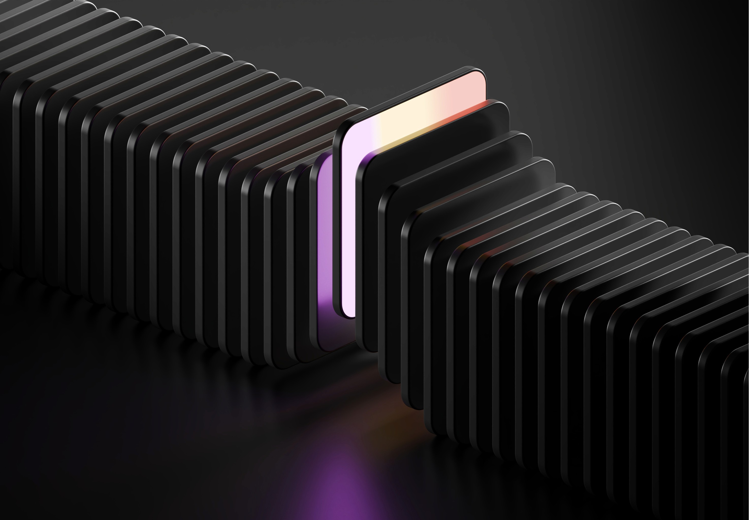
In a world filled with interfaces, clarity becomes a competitive advantage.
Users rarely read everything on a screen. Instead, they scan, compare, and make quick decisions based on visual cues. When structure and hierarchy are thoughtfully designed, information becomes easier to understand and actions become easier to take.
Good design is not about adding more elements. It is about organizing them in a way that reduces cognitive effort and guides attention naturally.
Why Structure Matters
Structure acts as the skeleton of an interface. Without it, even the most beautiful design becomes difficult to navigate.
Clear structure helps users:
understand where they are
find what they need faster
compare options with less effort
build trust in the product
When information is grouped logically and spaced intentionally, the interface starts to feel predictable. Predictability reduces friction.
The Role of Visual Hierarchy
Visual hierarchy determines what users notice first, second, and third.
Designers create hierarchy through:
typography scale
contrast
spacing
color emphasis
layout positioning
For example, large headlines signal importance, while muted secondary text supports the main message without competing for attention.
When hierarchy is done well, users don't have to think about where to look. Their eyes simply follow the path designed for them.

Reducing Cognitive Load
Every extra decision costs mental energy.
Clear design reduces this load by presenting information in digestible layers.
Some practical approaches include:
limiting the number of primary actions
grouping related content
using consistent layout patterns
highlighting the most important elements
The goal is simple: make the interface feel obvious.
Designing for Faster Decisions
When structure and hierarchy work together, interfaces become intuitive.
Users can quickly answer questions like:
What is this page about?
What should I do next?
Where do I go from here?
Design that answers these questions visually creates momentum. Instead of searching for meaning, users move forward confidently.
Conclusion
Clarity is not a decorative quality. It is a functional one.
Designers who prioritize structure and hierarchy create interfaces that respect users' time and attention. And in digital products, that respect often becomes the difference between confusion and engagement.
Recent posts


